Through observational research, interviews, site visits and other qualitative and quantitative research. A problem was defined and the journey to create a solution that was compelling and centred with the users in mind. We were to create something that we were passionate about and in this case I created something to do with movement and dance.
Brand Identity/Type Systems
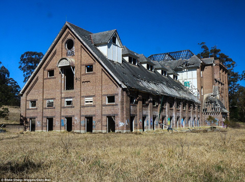


We were asked to research a site that was disused, abandoned, or neglected. A complete rejuvenation of the site, a name for the space, and a visual identity were required. A few typefaces were to be chosen to create the base of the logotype and to create a unique brand mark that reflects the direction of the site re-development.
The Brief
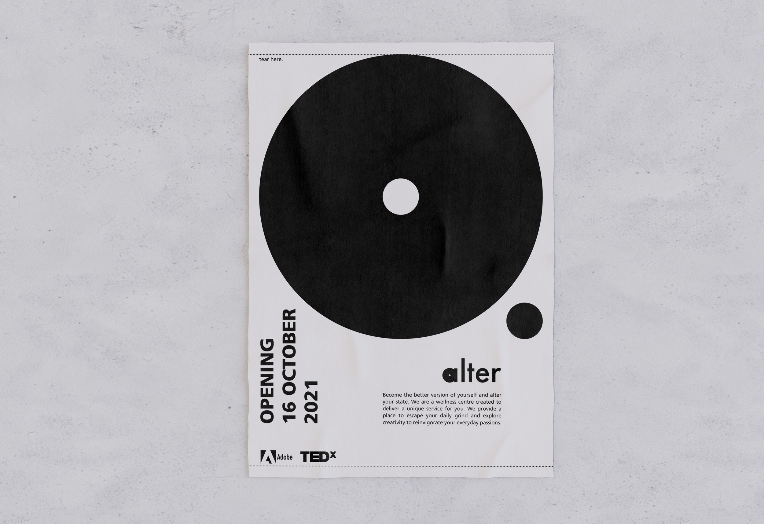
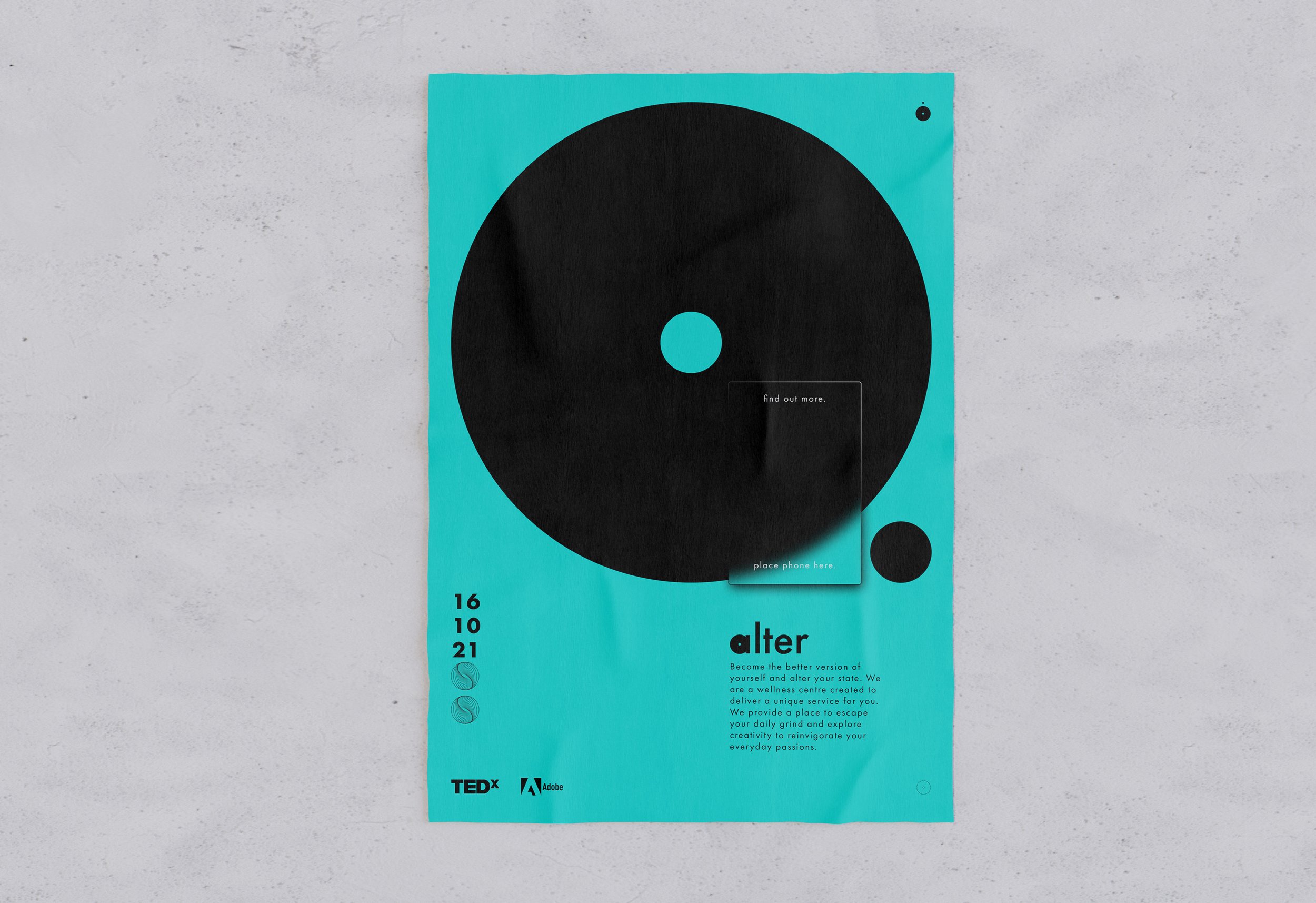
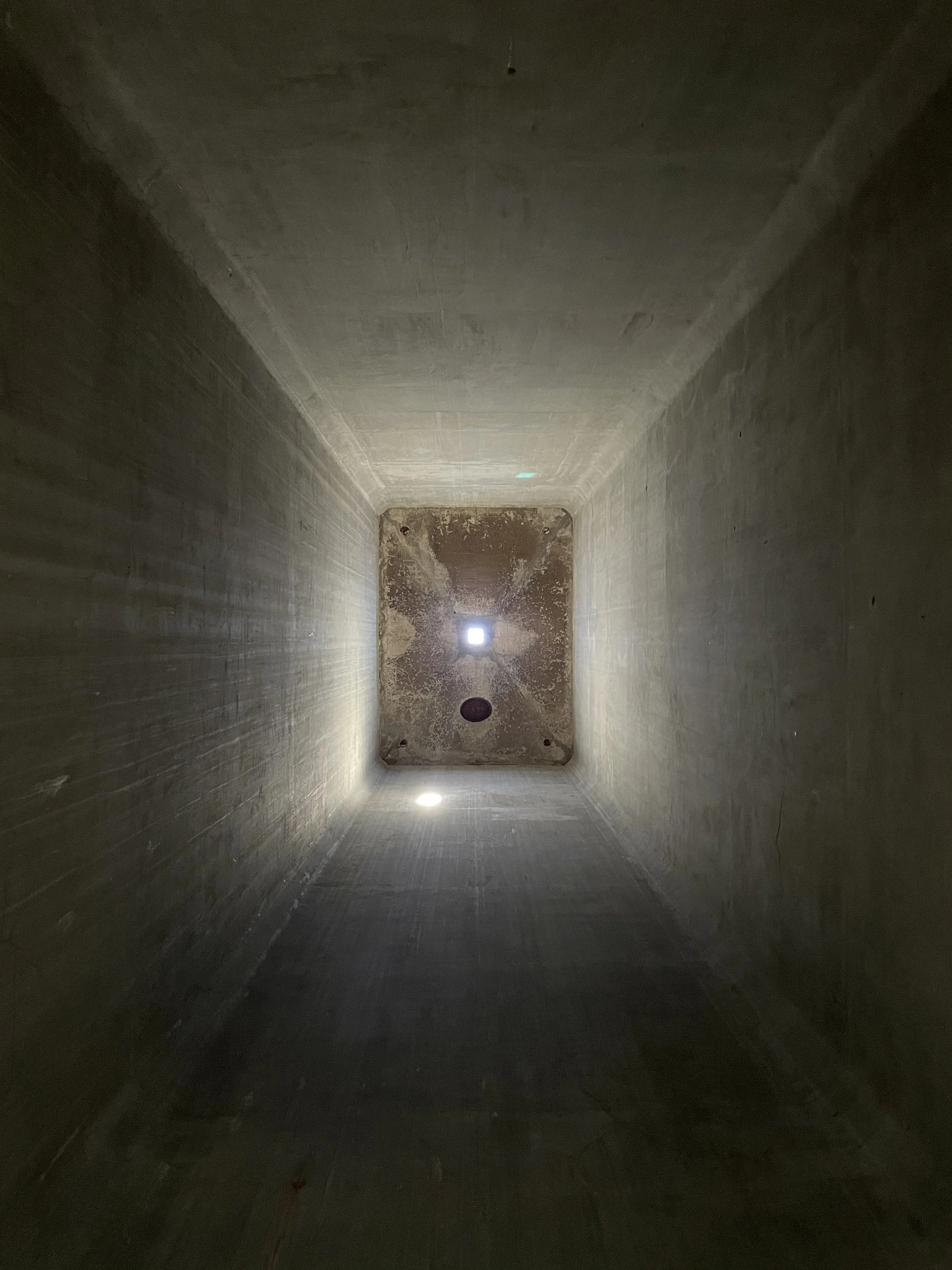
Mittagong Maltings was the site chosen and the objective was to turn it into a creative retreat for people who wanted to get inspired, rejuvenate and find solutions around their creative blocks. The intention was to help them relax from the hustle of their careers and get an opportunity for improvement and self-growth.
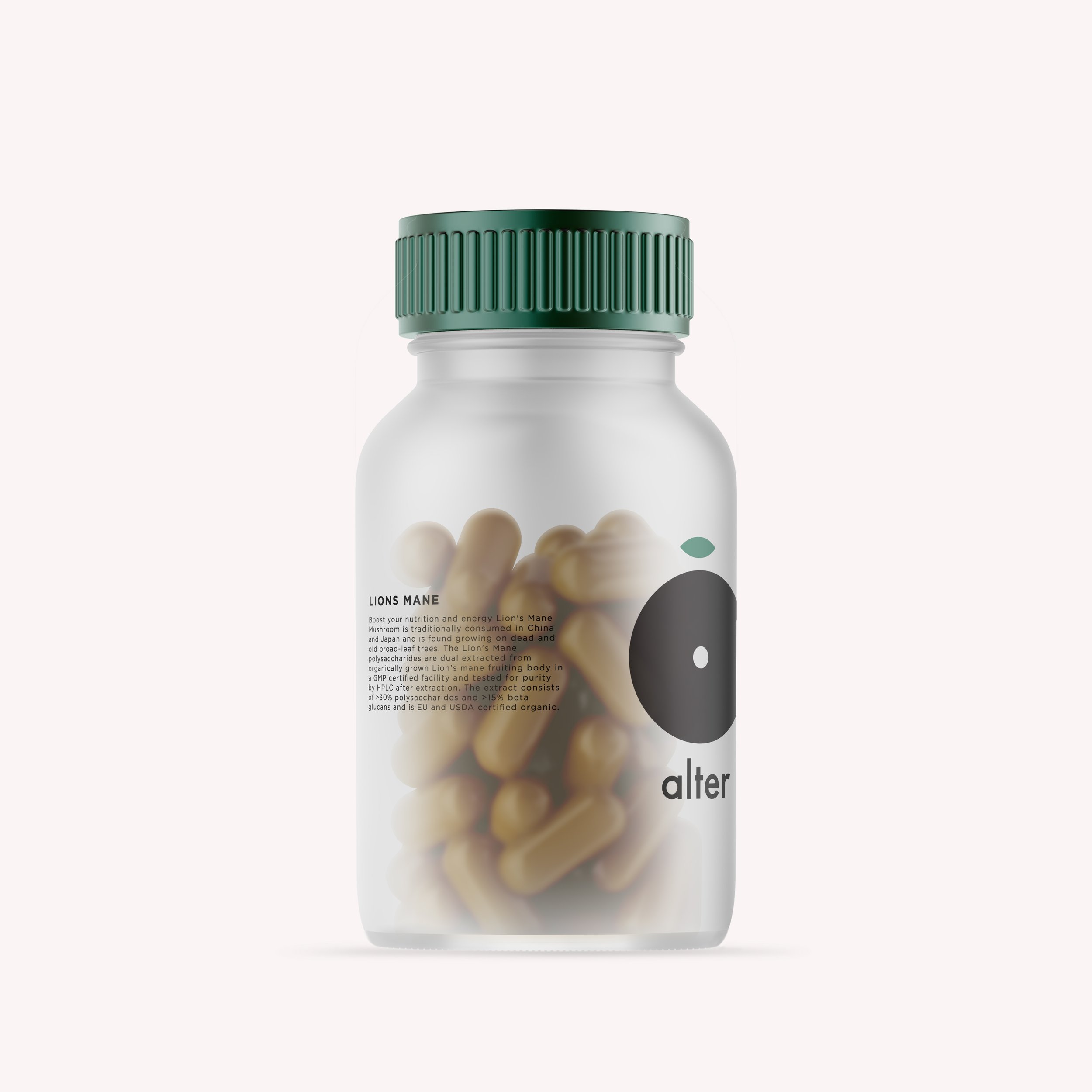
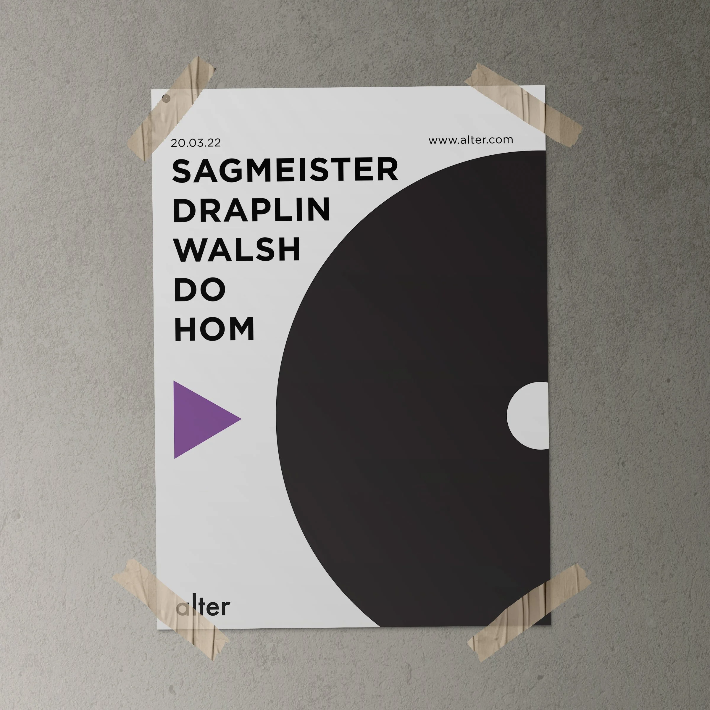
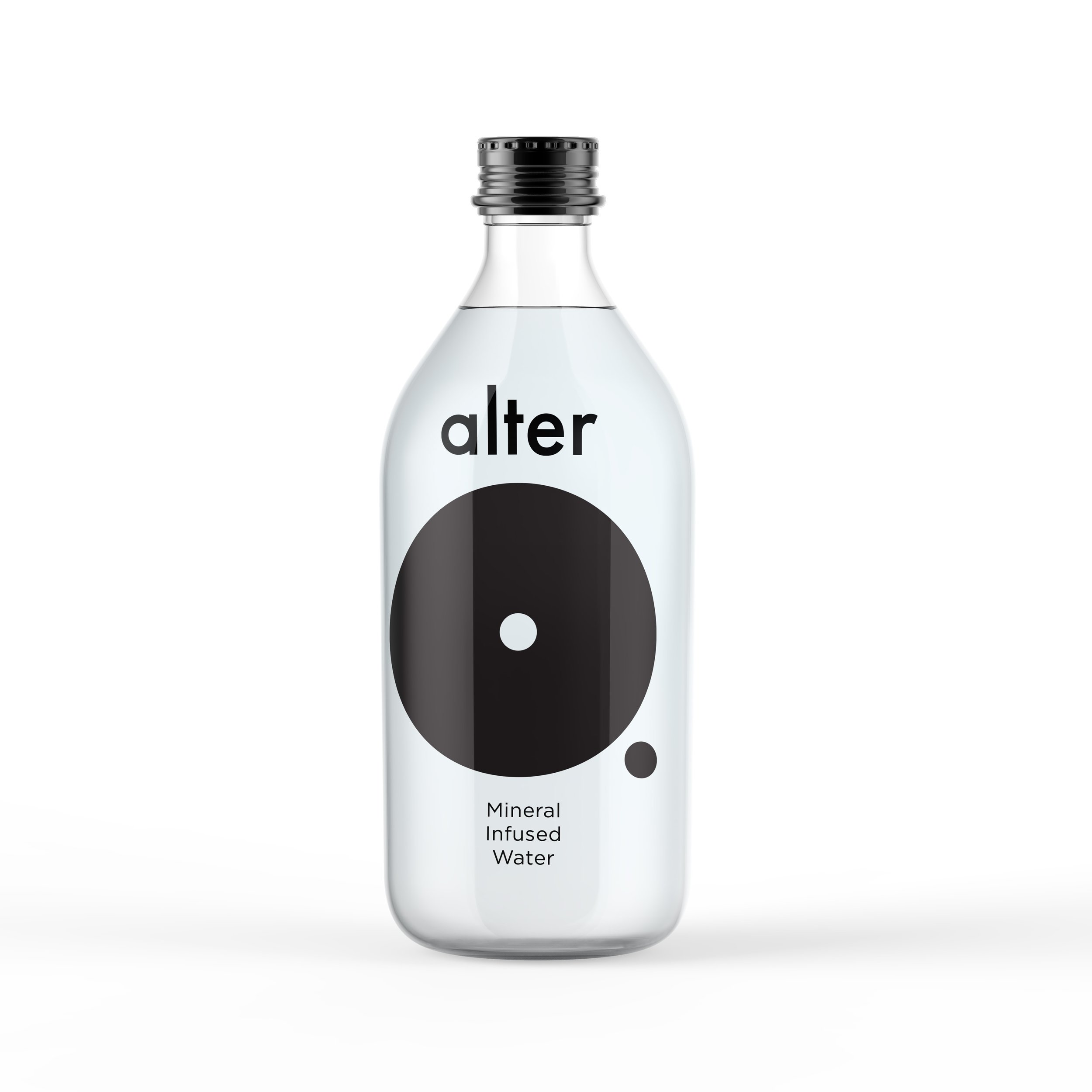
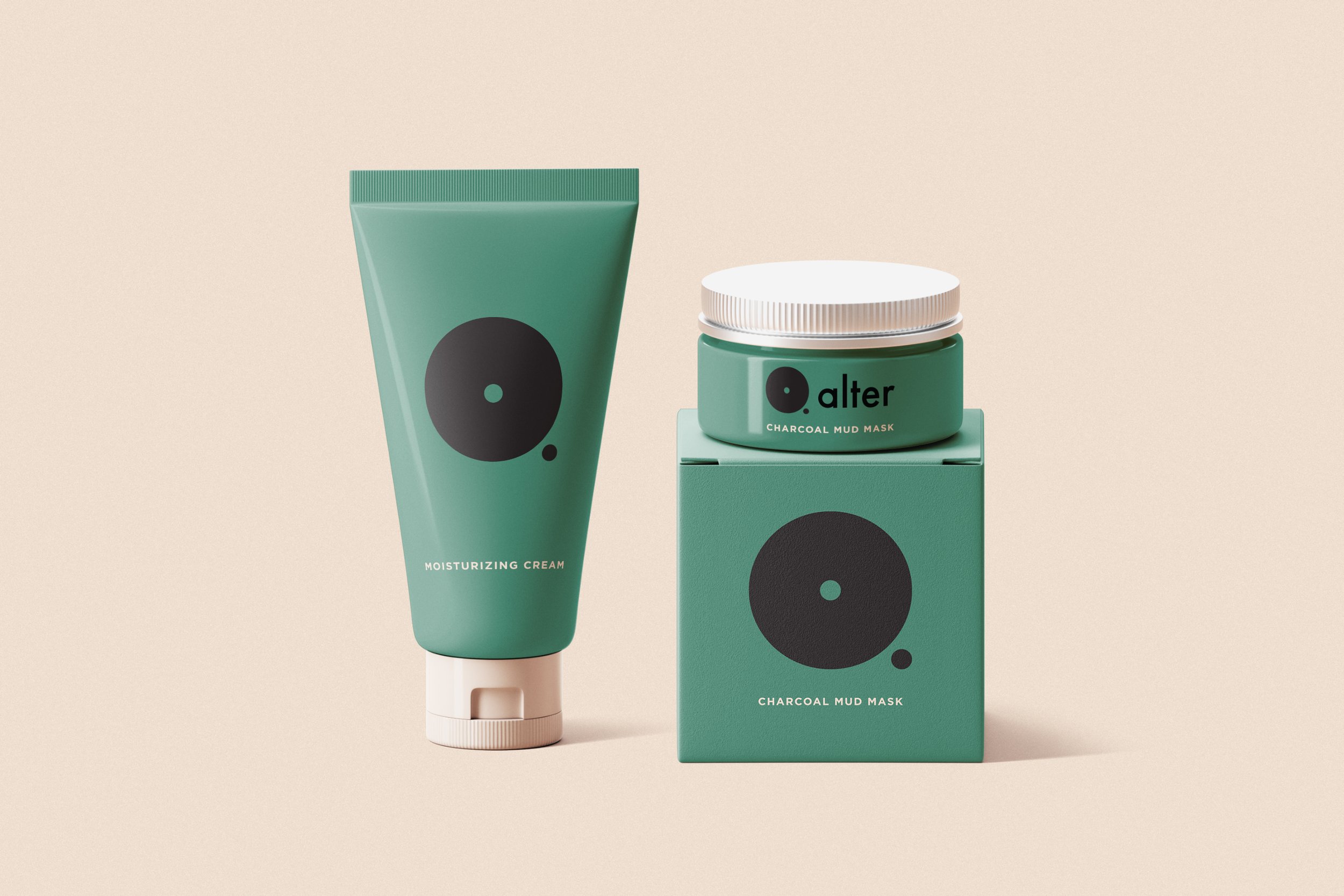
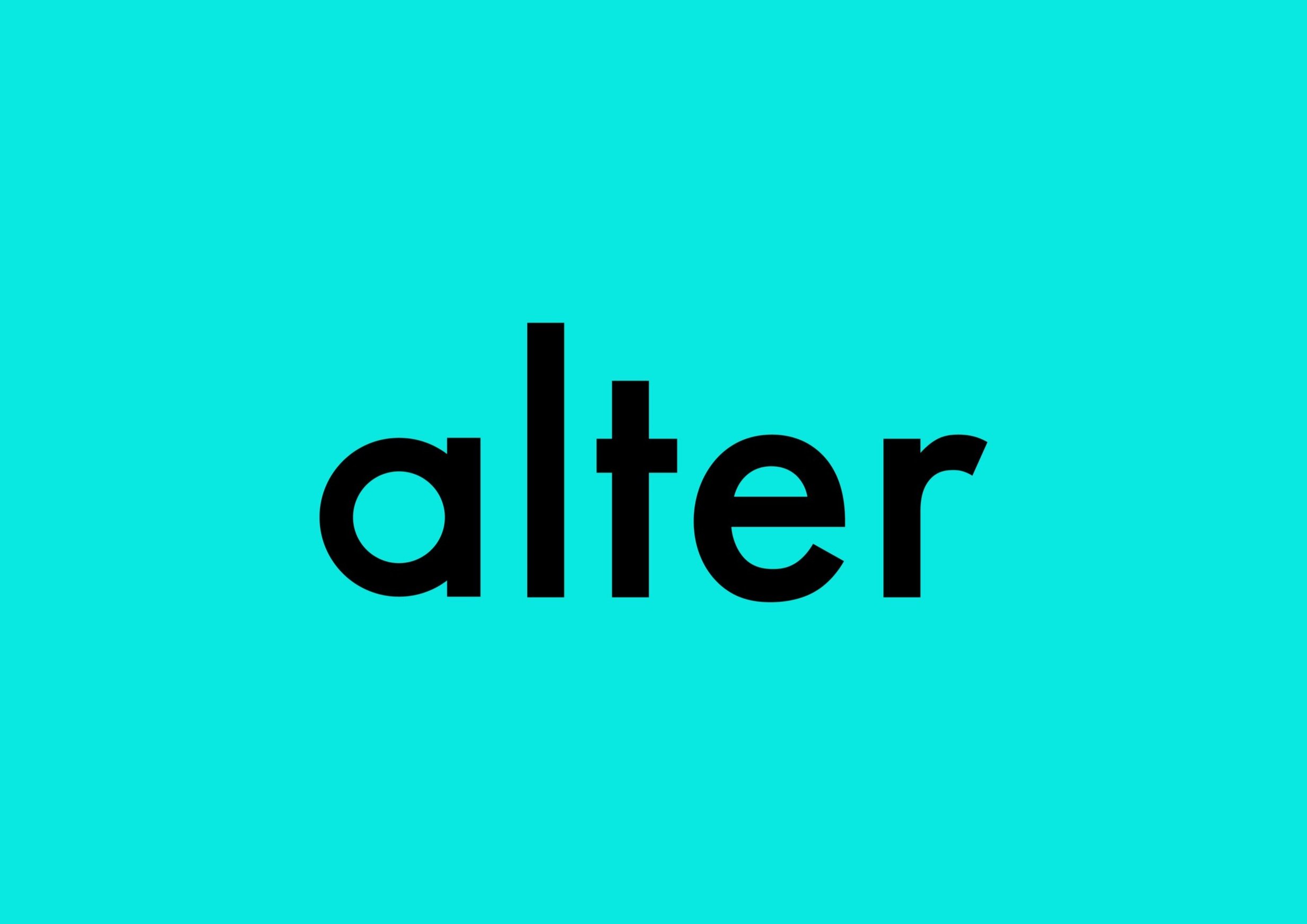
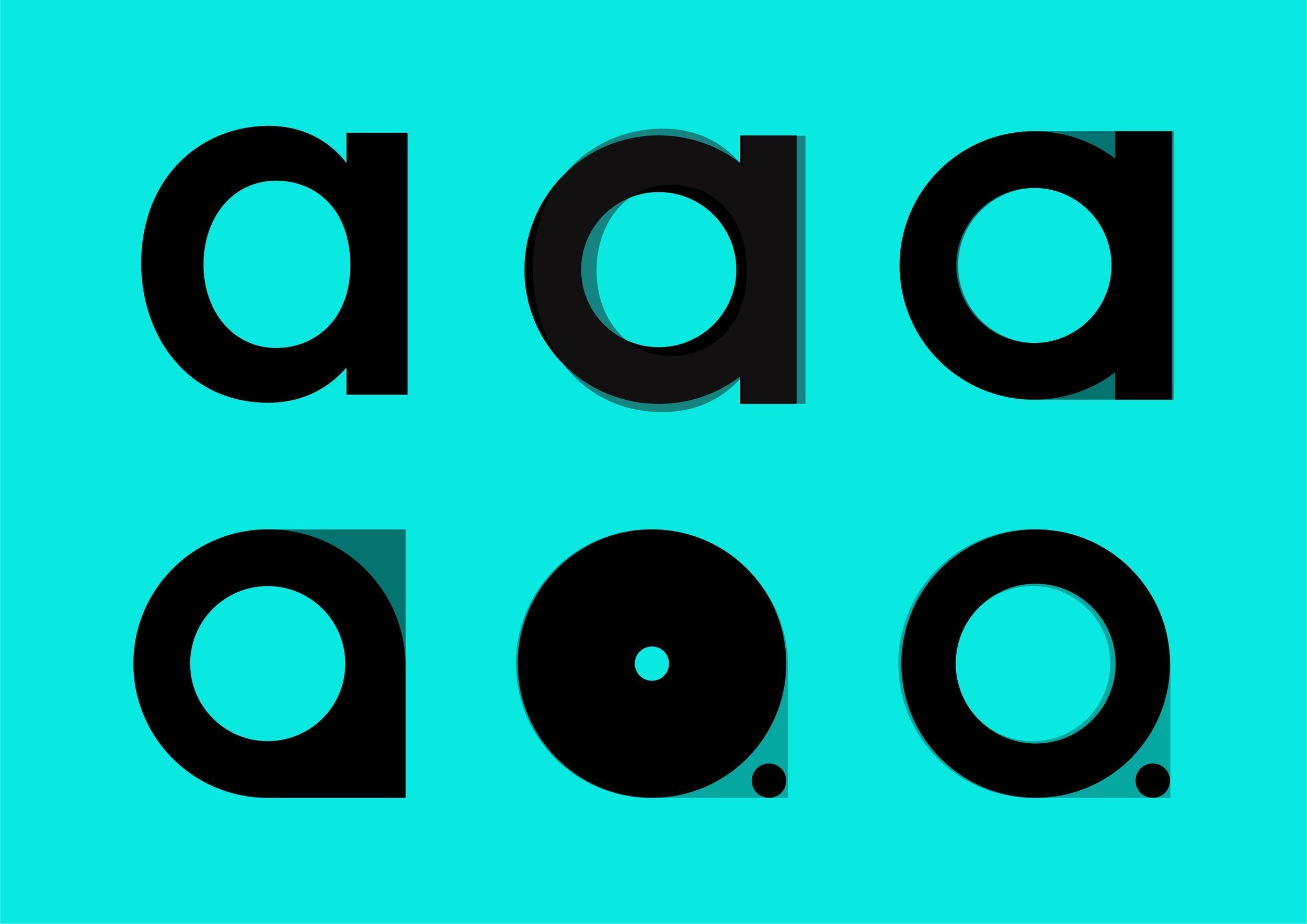
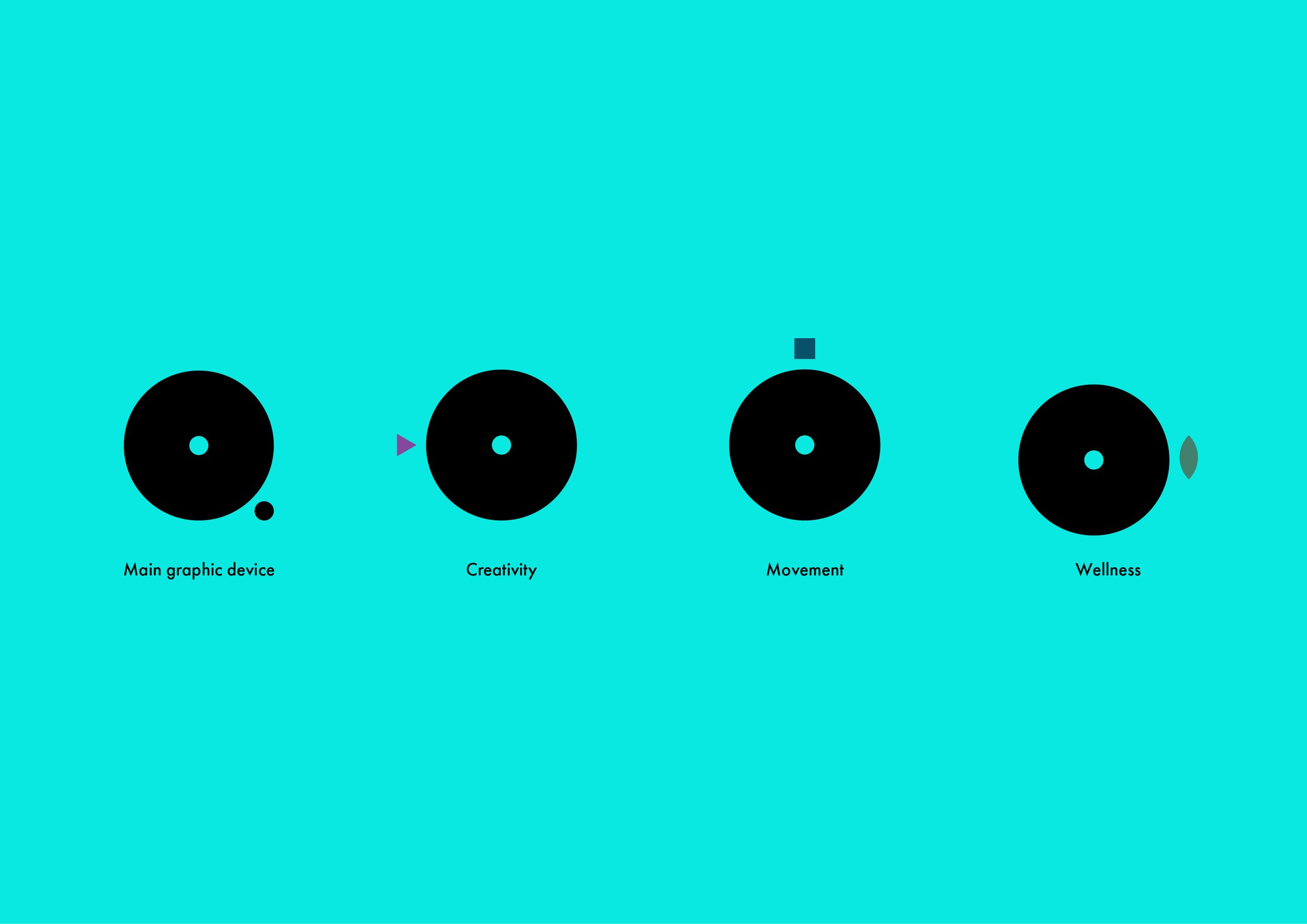
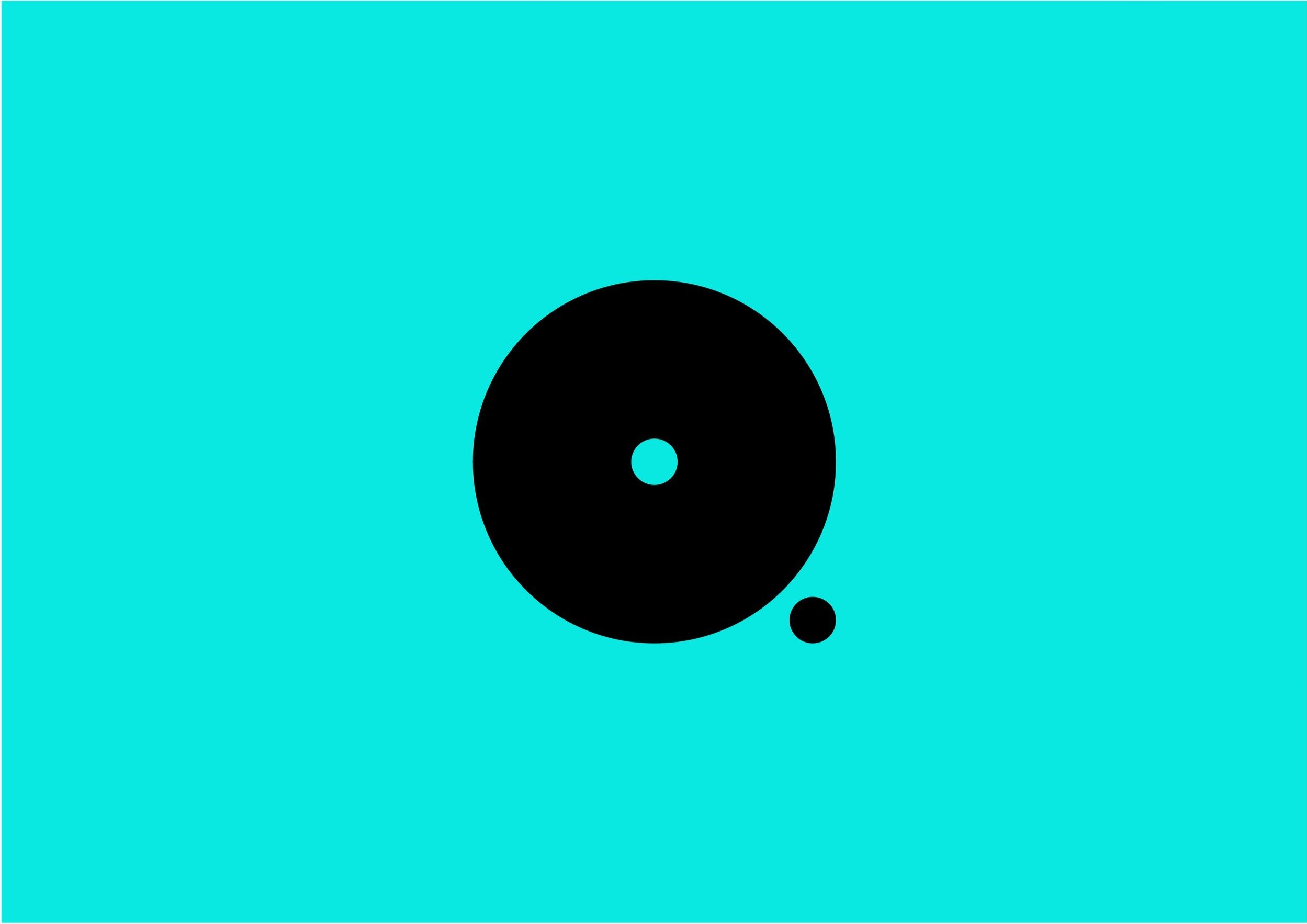
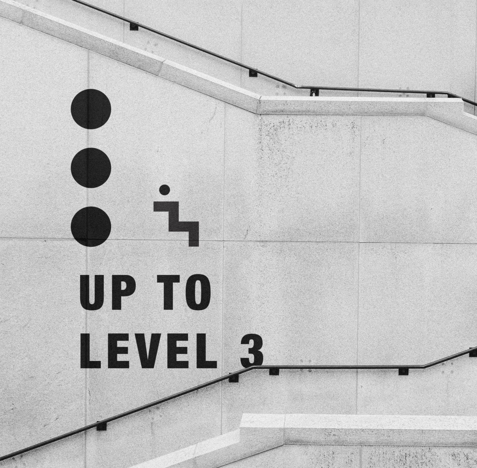
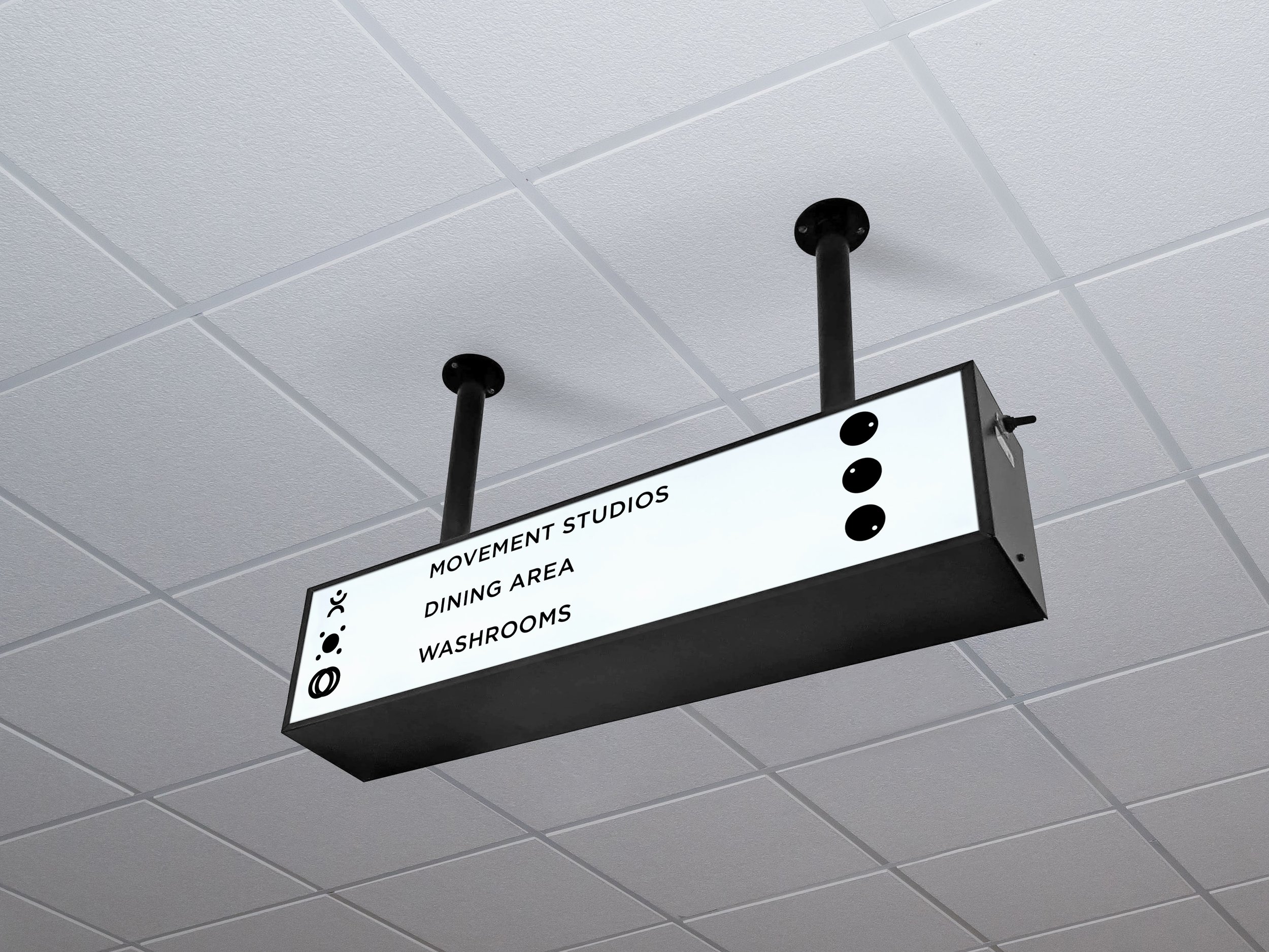
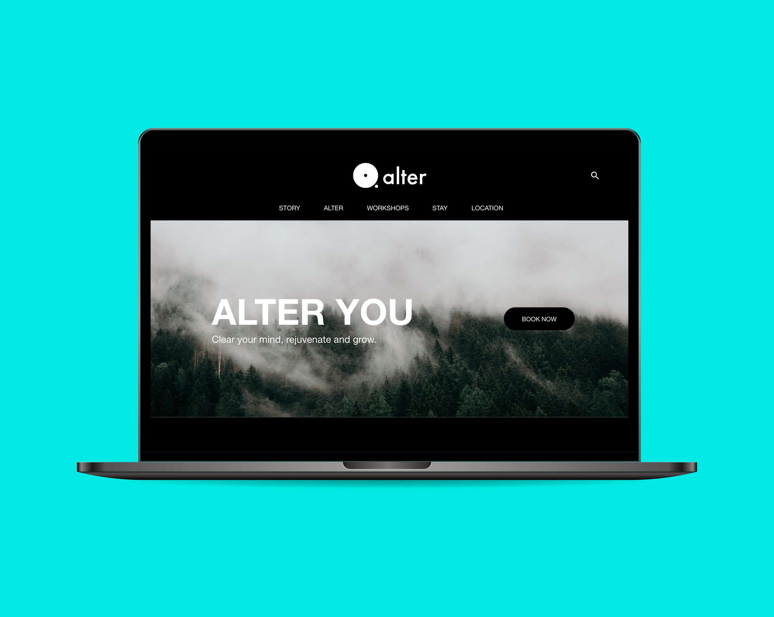
My approach was to create something with simplicity to communicate the complex aspects of the brand. The graphic device and logotype were both inspired from a structural reference found when I visited the area. Through heaps of refinement, iterations and drafts I managed to create a unique graphic device and language for the brand which is used to tell a story.
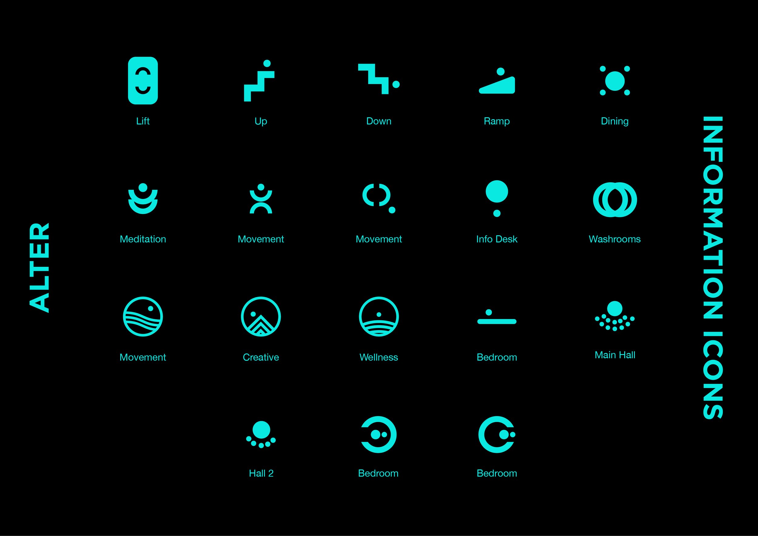
The language will be used through out the brand to guide the consumers on how to interact, use and understand every aspect of the brand and space. This will be shown through website UX/UI, way-finding and icons.
I wanted to create a unique brand that differentiated this space from gyms and wellness centres.